Notes on new features of Google Analytics Reporting API v4
Published: Jul 29th 2020 | 8 min read

The current version of the Google Analytics Reporting API was introduced some time ago offering several new features in comparison to the previous version. While the API v3 is still going to be supported, it might be beneficial to consider using the newer API v4 as it presents several interesting cases. With the API v4, you can use the same structure of queries as before, however, you can benefit from the new features, which will help you access your data more efficiently.
This summary describes the improvements in more detail – what is new in the v4 API and why it is beneficial. There are 4 main cases plus a few additional possibilities included in the current version of the Reporting API.
Special features we find the most beneficial:
- Metric expression
- Histograms
- Cohorts
- Pivot
Why use Google Analytics Reporting API in general
The Google Analytics Reporting API is widely used as it is a part of the standard version of Google Analytics. It allows you to
- Quickly obtain data for further processing and analysis
- Reach data by querying from code (using authentication) or some advanced solution (e.g. Roivenue)
- Explore data using many ready-made integrations (including the Query Explorer)
- Save time by automating loading data and other reporting tasks
- Use data in advanced data analytical programs (e.g. Waaila)
In short, the Google Analytics Reporting APIs are very useful, so let’s have a look at the current version.
Extended metric expression
To simplify data manipulation, it is now possible to input expressions of metrics instead of single metrics’ names only. In particular, to compare the Pages per Session ratio across multiple groups of customers or multiple days, it is sufficient to write the formula for the ratio within the metric expression field and the resulting data directly lets you compare the evolution of the ratio without the need to transform the data further. The expression allows basic operations. While there is a limit on the number of characters within the expression, the most used formulas should fit within. You can choose your name for the output of the expression which further increases the legibility of the output data. This helps to create easily understandable tables with a single query.
| Month of the year | Pages per Session ratio |
|---|---|
| 01 | 5 |
| 02 | 5 |
| 03 | 6 |
| 04 | 5 |
| 05 | 4 |
| 06 | 4 |
{
  "reportRequests": [
    {
      "viewId": "XXXXXXXXX",
      "dateRanges": [
        {
          "startDate": "2020-01-01",
          "endDate": "yesterday"
        }
      ],
      "metrics": [
        {
          "expression": "ga:pageViews/ga:sessions",
          "alias": "page views sessions ratio"
        }
      ],
      "dimensions": [
        {
          "name": "ga:month"
        }
      ]
    }
  ]
}
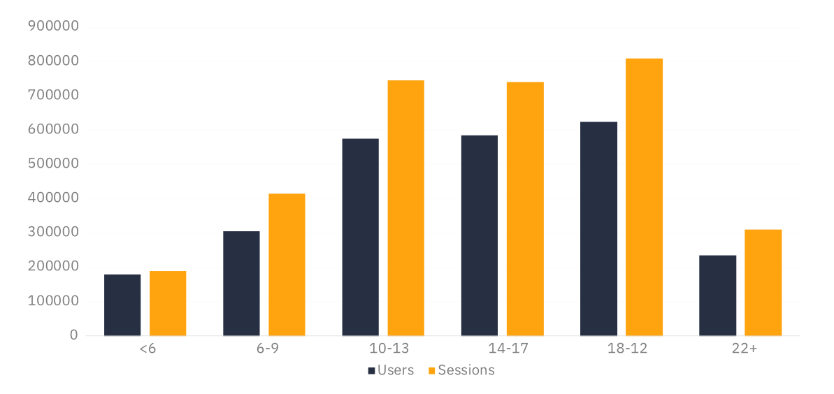
Histogram
Another feature extends the use of dimensions as it allows a numeric dimension to be converted into groups, so-called buckets, by specified breaks. The breaks work as thresholds separating the values into the buckets. There are always n+1 buckets for n thresholds - for two break points there will be three buckets with the following structure of names “<[break1]”, “[break1]”, “[break2]+”.
The easiest application of this feature lies in the aggregation of time variables, even though you’ll find further uses based on your specific case. The histogram allows you to construct quarters from months, combine several, even irregular amounts of days or weeks together, or compare several phases within a day. The last case is shown in the following example.
The histogram request results in an aggregated table of all selected metrics grouped by the created groups (buckets). The output does not change the structure of the data, so you can use the data in further programs and applications without the need to form any additional schema or adjust any data manipulations. You can select multiple metrics to compare the evolution of several values in parallel, as in the following example.
The output from this request can be transformed into a histogram using the buckets to form the columns with the values of metrics as their height. This provides an easy view of the evolution of your data.
{
  "reportRequests": [
    {
      "viewId": "XXXXXXXXX",
      "dateRanges": [
        {
          "startDate": "2020-01-01",
          "endDate": "yesterday"
        }
      ],
      "metrics": [
        {
          "expression": "ga:users"
        },
        {
          "expression": "ga:sessions"
        }
      ],
      "dimensions": [
        {
          "name": "ga:month",
          "histogramBuckets": ["1", "2", "3", "4", "5", "6"]
        }
      ],
      "orderBys": [
        {
          "fieldName": "ga:month",
          "orderType": "HISTOGRAM_BUCKET",
          "sortOrder": "ASCENDING"
        }
      ]
    }
  ]
}
Compare dimensions with pivot
Pivot tables help to separate the values of metrics more clearly by two selected dimensions. While it is possible to have an output with multiple dimensions even without the pivot feature (in the so-called long format with a row for each combination of dimensions), the pivot table allows a better comparison of the values within both dimensions. With the pivot table, you can check how the values change when keeping one of the dimensions the same and changing the other by following either the given rows or columns.
The resulting data have a different structure than the output of a simple query because the pivot table forms an additional object in the data rows. Therefore, to incorporate it into further transformations, the schema and the calculations need to be adjusted.
As an example, we provide an overview of sessions and users by 4 hostnames where the count of users is separated into months between months.
| 01 | 02 | 03 | 04 | 05 | 06 | |||
|---|---|---|---|---|---|---|---|---|
| Users | Sessions | Users | Users | Users | Users | Users | Users | |
| hostname 1 | 776 000 | 1 940 000 | 121 000 | 118 000 | 135 000 | 132 000 | 142 000 | 128 000 |
| hostname 2 | 605 000 | 1 512 500 | 89 000 | 91 000 | 102 000 | 104 000 | 112 000 | 107 000 |
| hostname 3 | 11 500 | 28 750 | 1 200 | 1 800 | 1 000 | 1 400 | 2 100 | 4 000 |
| hostname 4 | 8 500 | 21 250 | 1 500 | 900 | 1 200 | 1 100 | 1 700 | 2 100 |
| TOTALS | 1 401 000 | 3 502 500 | 212 700 | 211 700 | 239 200 | 238 500 | 257 800 | 241 100 |
{
  "reportRequests": [
    {
      "viewId": "XXXXXXXXX",
      "dateRanges": [
        {
          "startDate": "2020-01-01",
          "endDate": "yesterday"
        }
      ],
      "metrics": [
        {
          "expression": "ga:users"
        },
        {
          "expression": "ga:sessions"
        }
      ],
      "dimensions": [
        {
          "name": "ga:hostname"
        }
      ],
      "pivots": [
        {
          "dimensions": [
            {
              "name": "ga:month"
            }
          ],
          "metrics": [
            {
              "expression": "ga:users"
            }
          ]
        }
      ]
    }
  ]
}
Cohorts to track behavioral time evolution
A fourth specific feature of the GA v4 API requests is the introduction of the cohorts and lifetime value reports. While at the moment it only supports the acquisition date (date of their first visit) to separate the cohorts, it already provides meaningful insight by showing how users from the same day, week, or month performed in a selected aspect in comparison to other time cohorts during the selected period. You can learn about the behavior in terms of users, sessions, page views, goal completions, and similar cohort-specific metrics. The earlier cohorts are observed for longer, providing the data for more periods. In particular, when observing 3 monthly cohorts for 4 months, there are 4 periods of data for the earliest cohort and 2 periods for the latest. This allows you to compare how all the cohorts are behaving in the month of acquisition as well as in the month after the acquisition. Moreover, you can analyze how one cohort evolves over several months.
| Cohort | Month 0 | Month 1 | Month 2 | Month 3 |
|---|---|---|---|---|
| 2020-03 | 165 000 | 25 000 | 8 400 | 4 200 |
| 2020-04 | 174 000 | 28 000 | 9 200 | - |
| 2020-05 | 189 000 | 32 000 | - | - |
{
  "reportRequests": [
    {
      "viewId": "XXXXXXXXX",
      "includeEmptyRows": true,
      "metrics": [
        {
          "expression": "ga:cohortActiveUsers"
        }
      ],
      "dimensions": [
        {
          "name": "ga:cohort"
        },
        {
          "name": "ga:cohortNthMonth"
        }
      ],
      "orderBys": [
        {
          "fieldName": "ga:cohort"
        }
      ],
      "cohortGroup": {
        "cohorts": [
          {
            "type": "FIRST_VISIT_DATE",
            "name": "2020-05-01 to 2020-05-31",
            "dateRange": {
              "startDate": "2020-05-01",
              "endDate": "2020-05-31"
            }
          },
          {
            "type": "FIRST_VISIT_DATE",
            "name": "2020-04-01 to 2020-04-30",
            "dateRange": {
              "startDate": "2020-04-01",
              "endDate": "2020-04-30"
            }
          },
          {
            "type": "FIRST_VISIT_DATE",
            "name": "2020-03-01 to 2020-03-31",
            "dateRange": {
              "startDate": "2020-03-01",
              "endDate": "2020-03-31"
            }
          }
        ]
      }
    }
  ]
}
Further additions
Among other benefits of the new API v4 belongs the possibility to use multiple date ranges. This simplifies the procedure to compare values in a short time period to some long-term trend which provides you information about how you are performing in a shorter period.
Furthermore, multiple segments can be included in a single request. Segments can be used to divide data either to pre-constructed groups using segment ID, e.g. new users or to custom specified groups created using segment filters on dimensions. When multiple segments can be included, you can compare groups of observations without the need to construct multiple queries and combine the resulting data. It can be beneficial for example in comparisons of new vs. returning users or in comparisons of users from different browsers.
Conclusion
To summarise, the new API v4 enriches the features of Google Analytics API and provides you with more ways to optimize the manipulation and display of data. A clearer view of your data helps you reach more informed solutions and detect potential problems sooner. The testing of the new version revealed new options on how to use the reporting and turn it into a business advantage.
Our tool for web analytics validation – Waaila has the new features implemented. Check out the official website for more info.